2025
Hy Cores
Entrant
Shenzhen BLANK Creative Co., Ltd.
Category
Interactive Design (IxD) - Visual Identity
Client's Name
Country / Region:
China
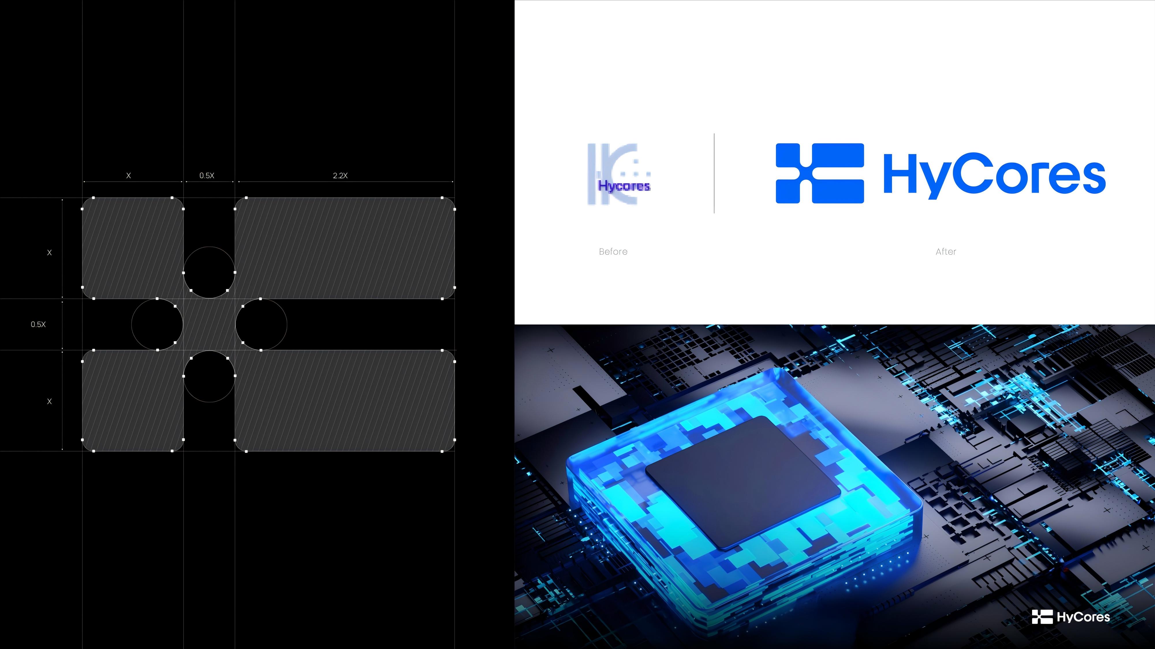
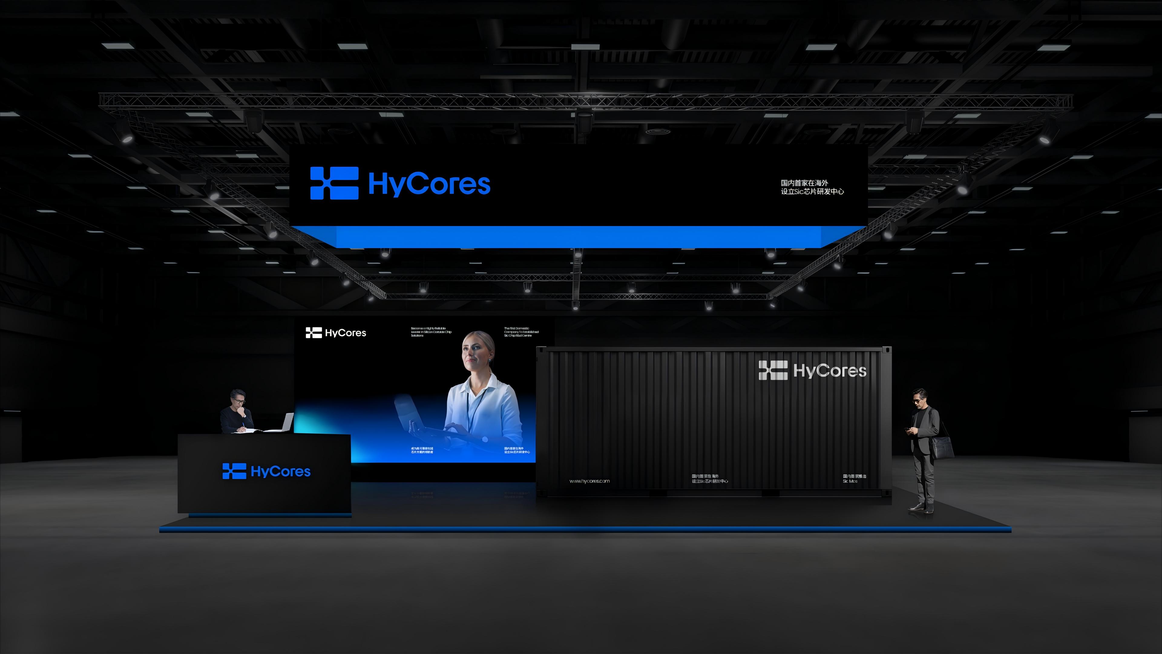
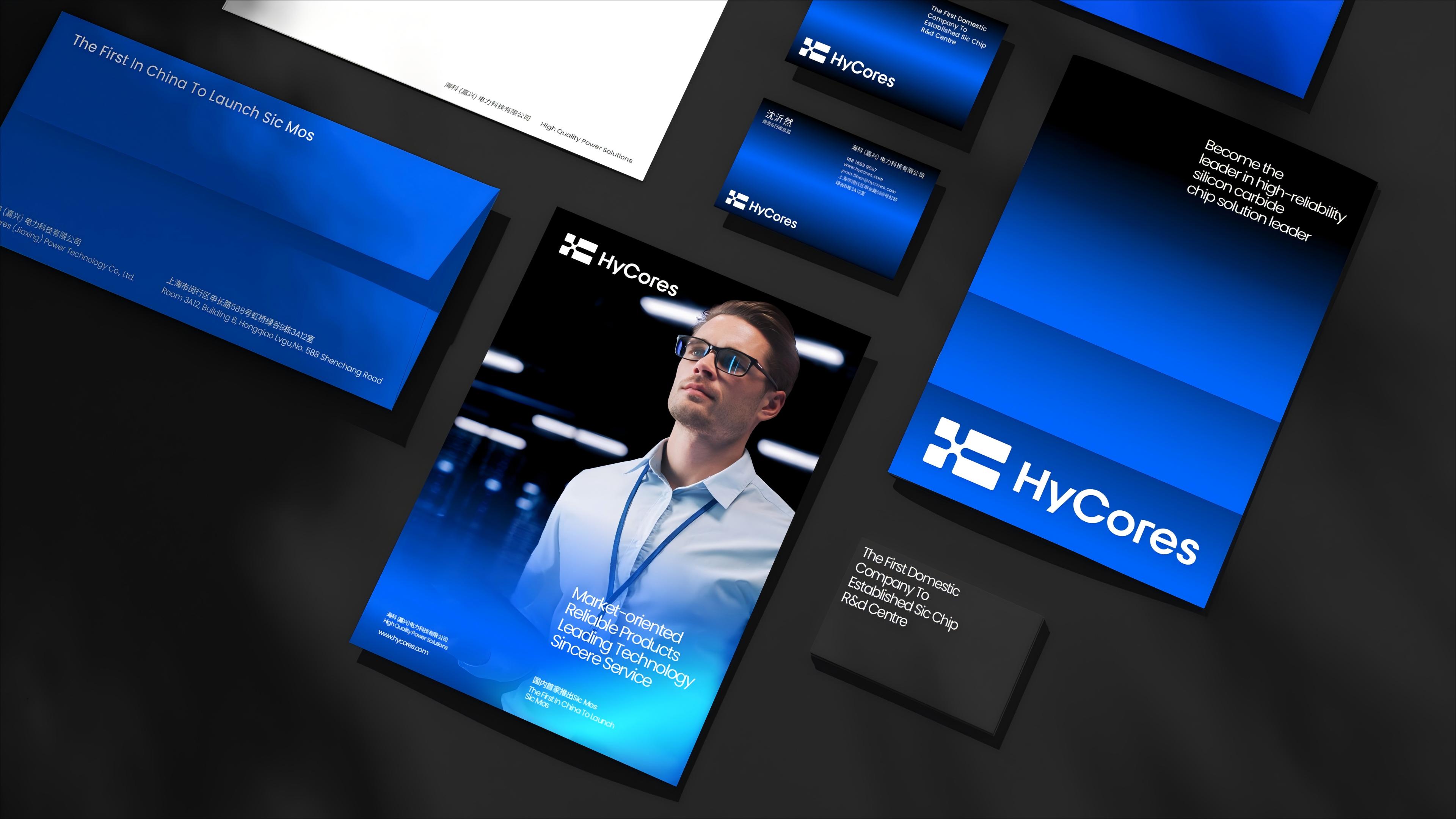
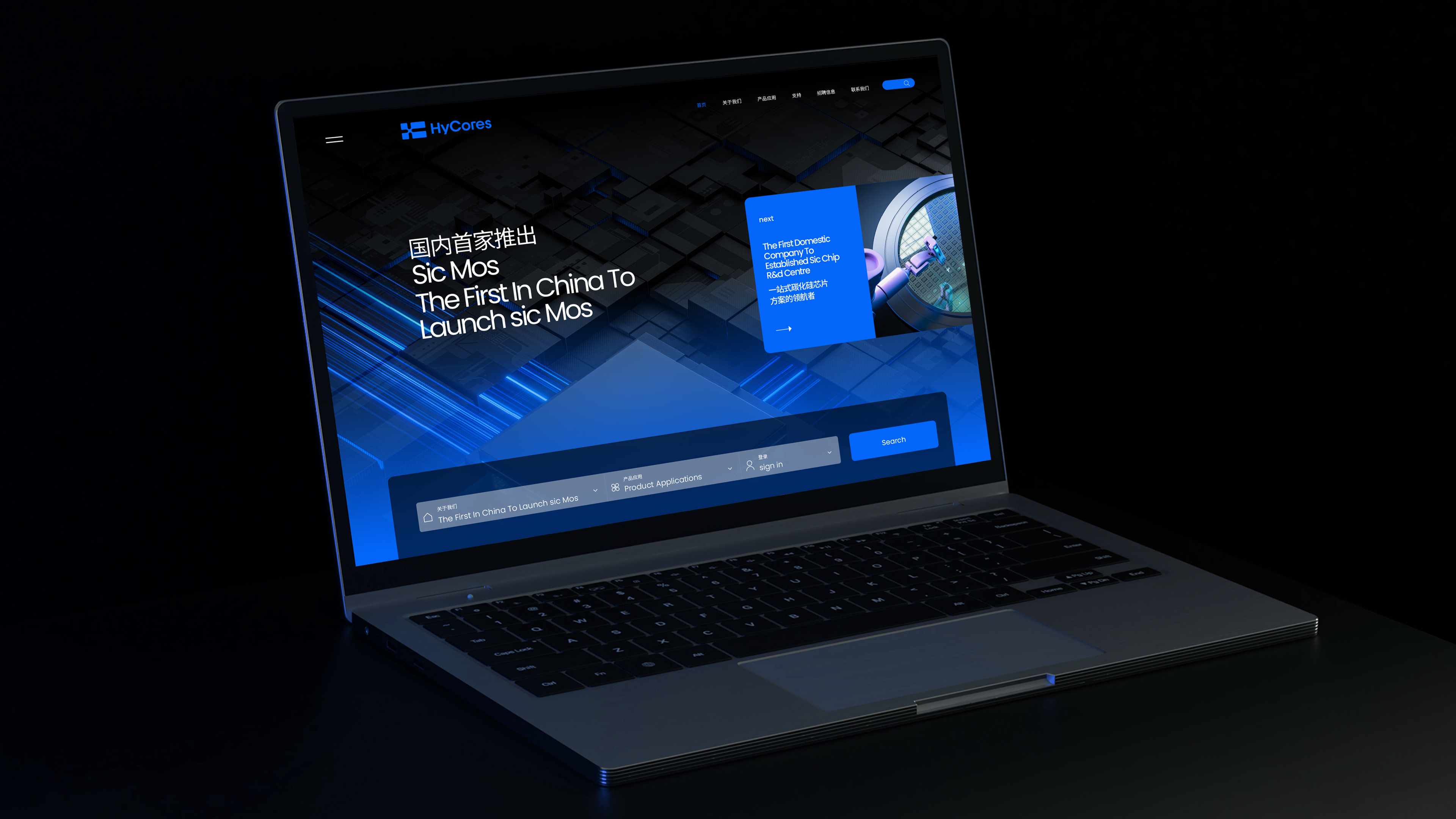
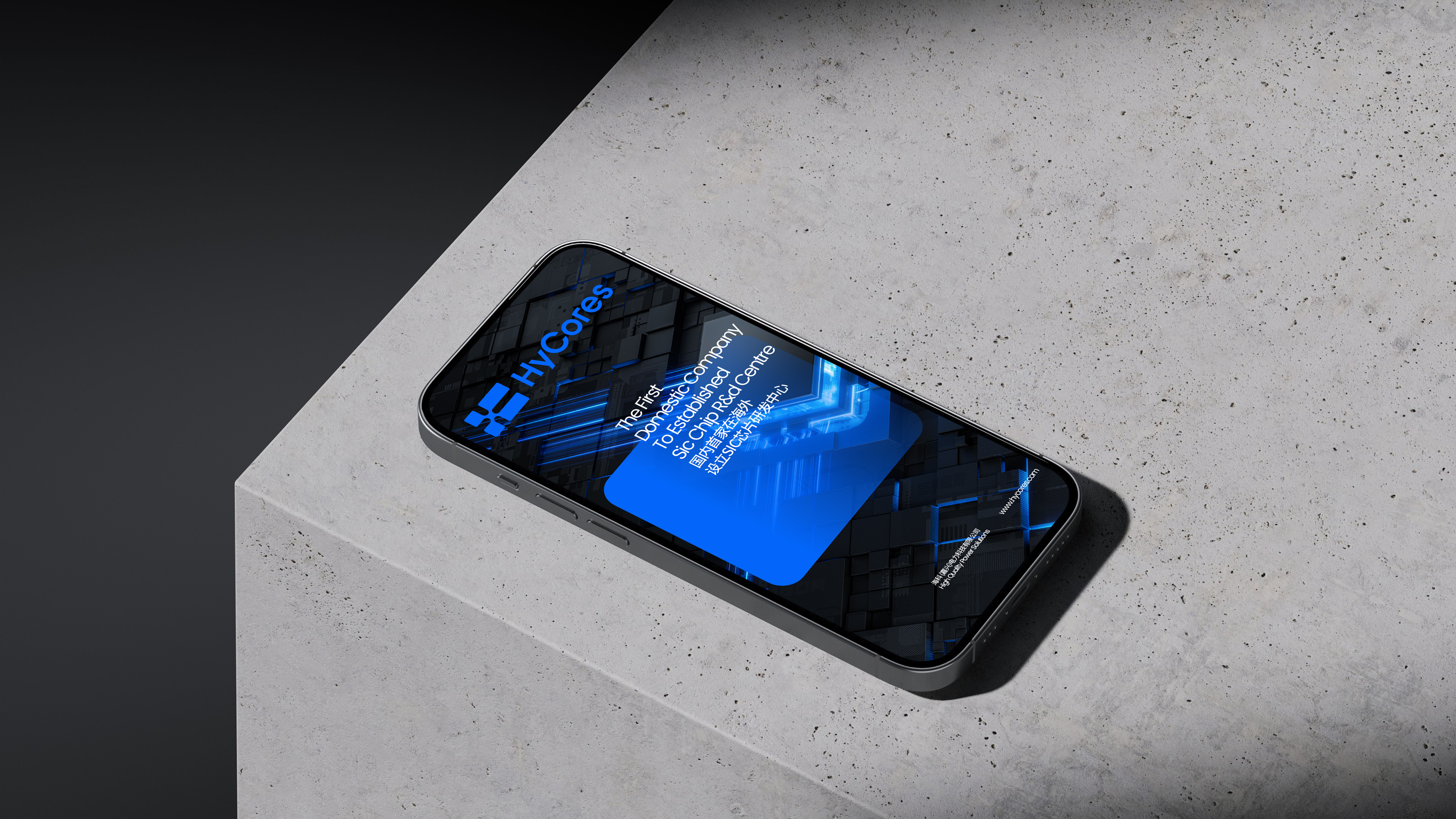
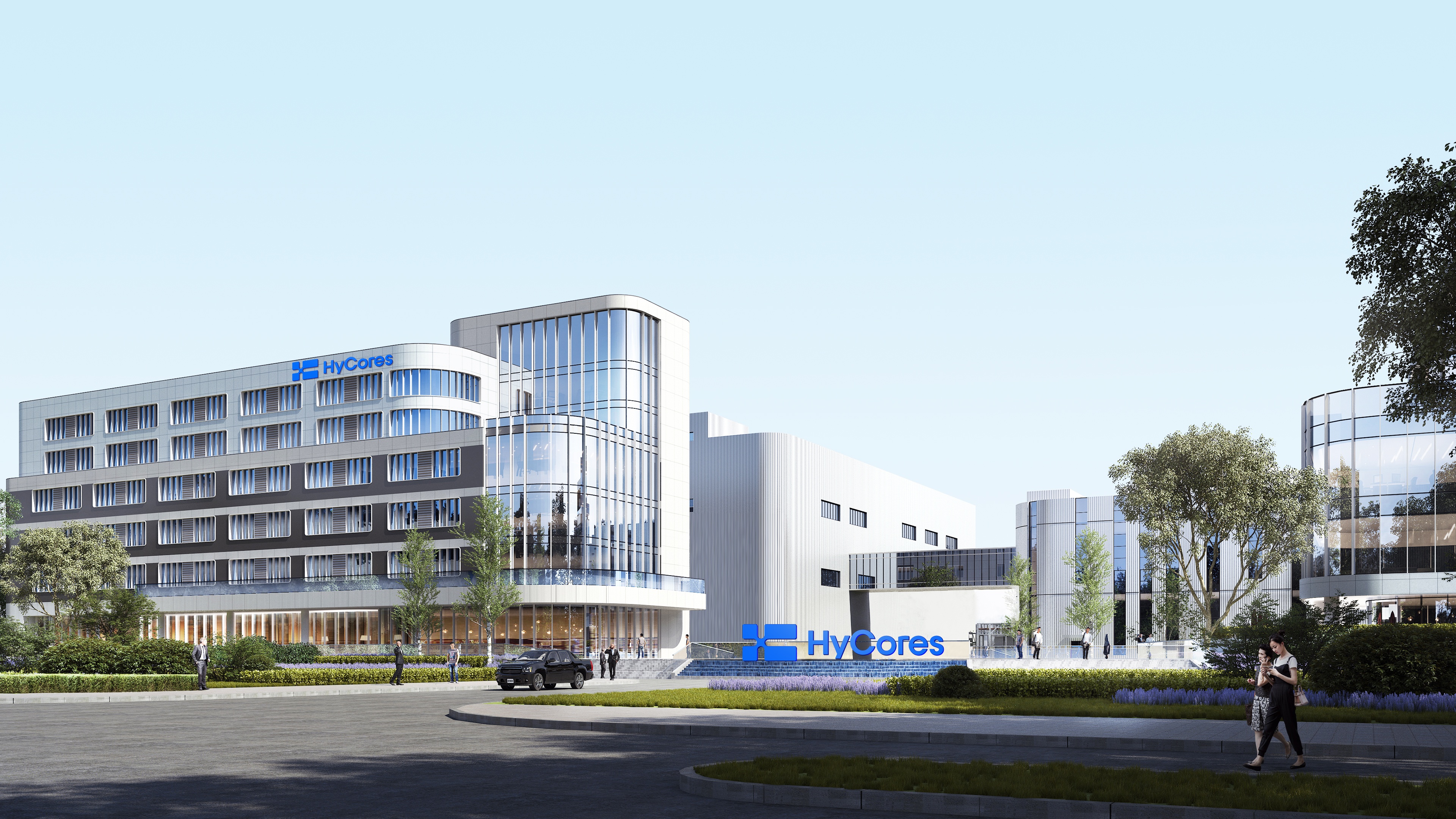
The Hy Cores logo is inspired by a chip, using an abstract chip as its core graphic to symbolically and intuitively represent the company’s core business in chip design and manufacturing. The logo reflects Hy Cores’ professionalism and focus in the chip technology field while emphasizing the company’s authoritative presence and technical strength in the high-tech industry. Through the abstraction of the chip form, the logo conveys a strong sense of technology while maintaining high recognizability, allowing the brand to quickly establish its identity in a competitive market.
The logo adopts a square structure. The square as a visual element conveys modernity and stability, closely associated with technology and innovation, while reflecting the company’s advanced capabilities and innovative spirit in the chip sector. At the same time, the square symbolizes a solid structure and firm foundation, aligning with the inherent structural characteristics of chips, highlighting product stability, reliability, and robustness, and demonstrating the company’s emphasis on product quality and technical precision. At the center, the chip element forms a connection point, symbolizing information transmission and interconnectivity, emphasizing the chip’s role as a core component in modern electronic systems and representing the company’s broad influence in information technology and chip applications.
Additionally, the logo subtly incorporates the initials “HC” from Hy Cores’ English name, enhancing brand specificity and strengthening the connection between the logo and the company, thereby improving brand recognition. Beyond showcasing technical and functional attributes, the logo embodies the company’s culture, reflecting Hy Cores’ philosophy of collaborative success. It conveys the company’s commitment to providing comprehensive services, rapid application implementation, and customer-focused solutions. The ability to offer interchangeable and customized components according to client needs is also implicitly expressed in the logo’s design, highlighting flexibility and a customer-oriented approach.

Credits
Entrant
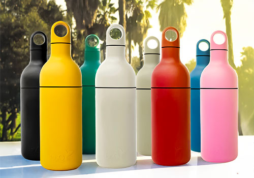
Buoy, LLC
Category
Sports Accessories - Sports Water Bottles
Country / Region
United States
Entrant
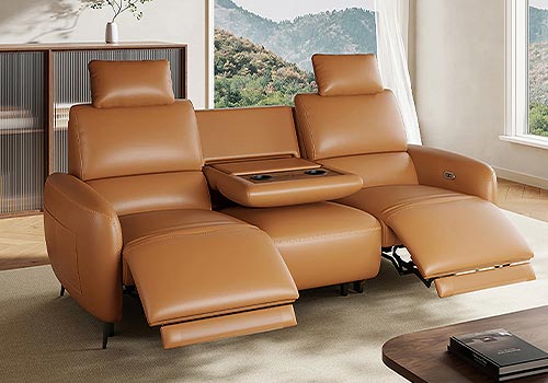
Nichelife Inc
Category
Seating & Comfort Furniture - Sofa
Country / Region
United States
Entrant
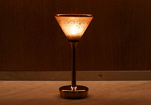
Hiroki Nakayama
Category
Lamps & Luminaires - Portable Lamps
Country / Region
United States
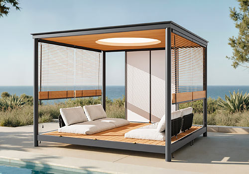
Entrant
Foshan Sanshui Auvis Furniture Products Co., Ltd
Category
Garden Furniture - Patio
Country / Region
China