2025
Rao's Made for Home Frozen Entrée Package Design
Entrant
The Campbell's Company
Category
Food - Ready-to-Eat, Fast Food, Meal Kits
Client's Name
Rao's Homemade
Country / Region:
United States
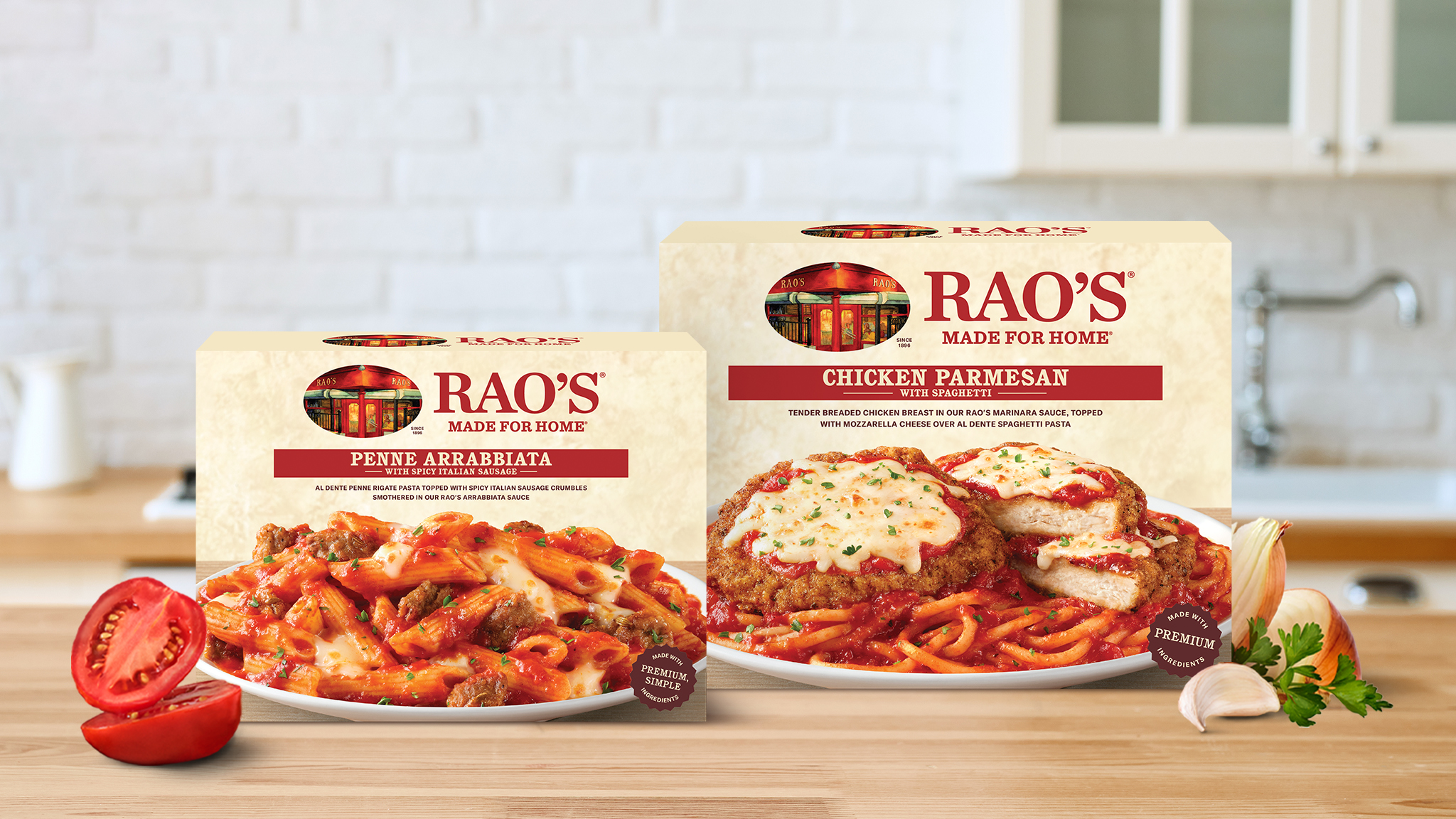
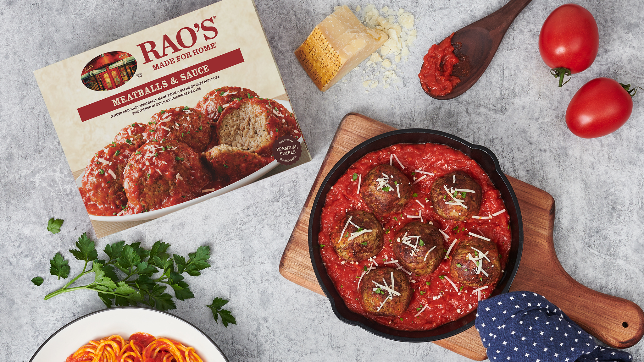
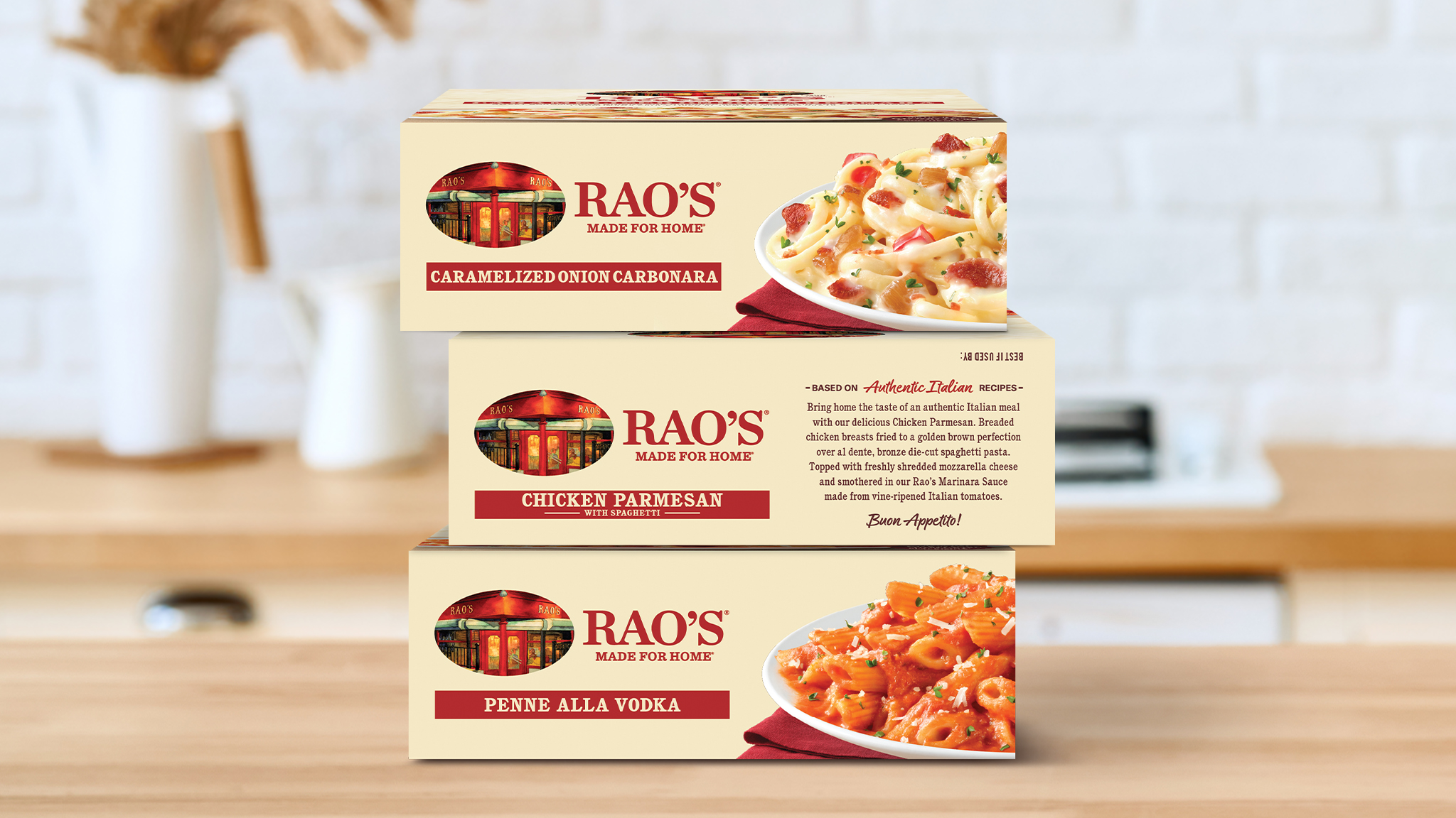
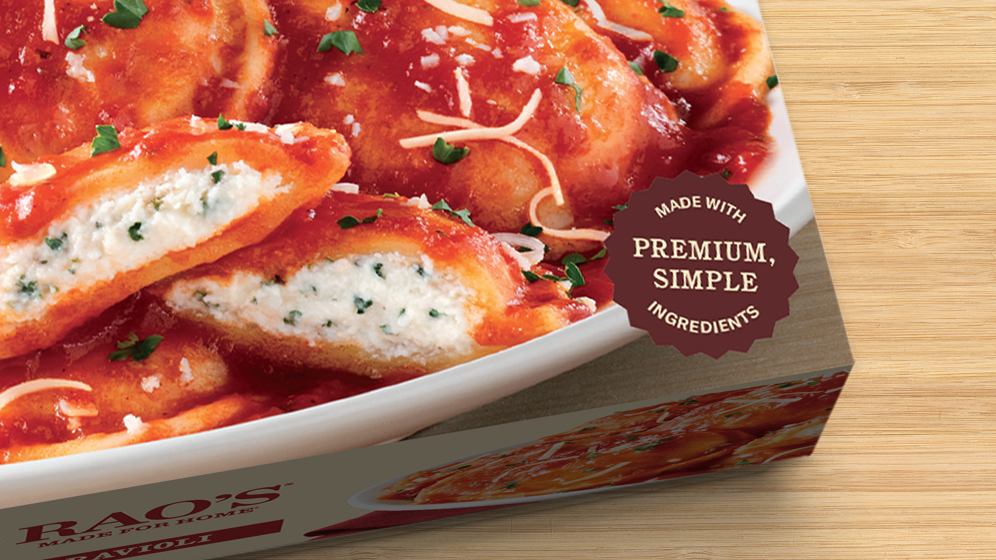
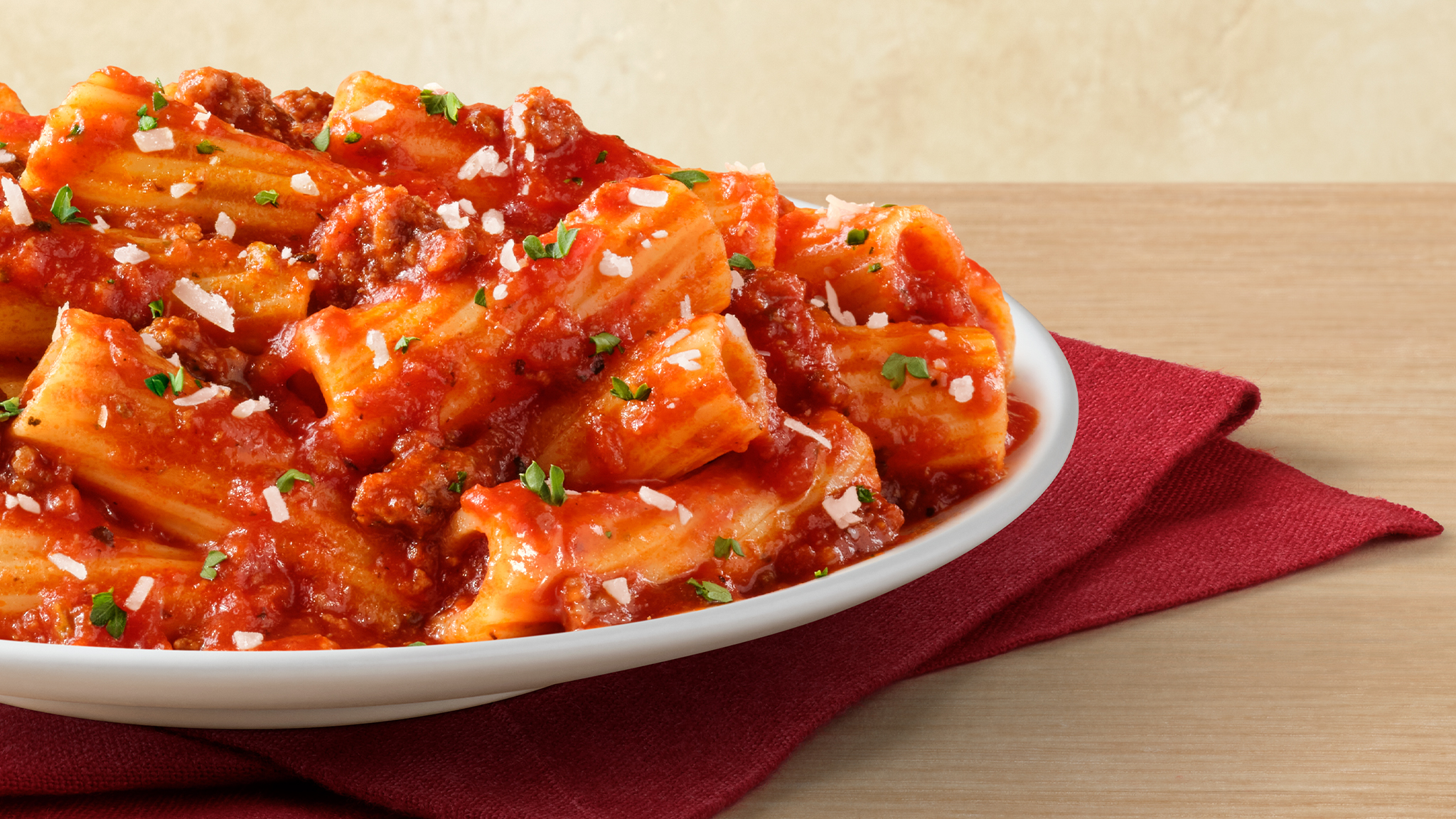
The Design: From the start, we knew that leading with food photography was imperative since appetite appeal drives purchase decisions. Our goal was to create packaging that instantly ignites desire and excites the senses through delicious food photography.
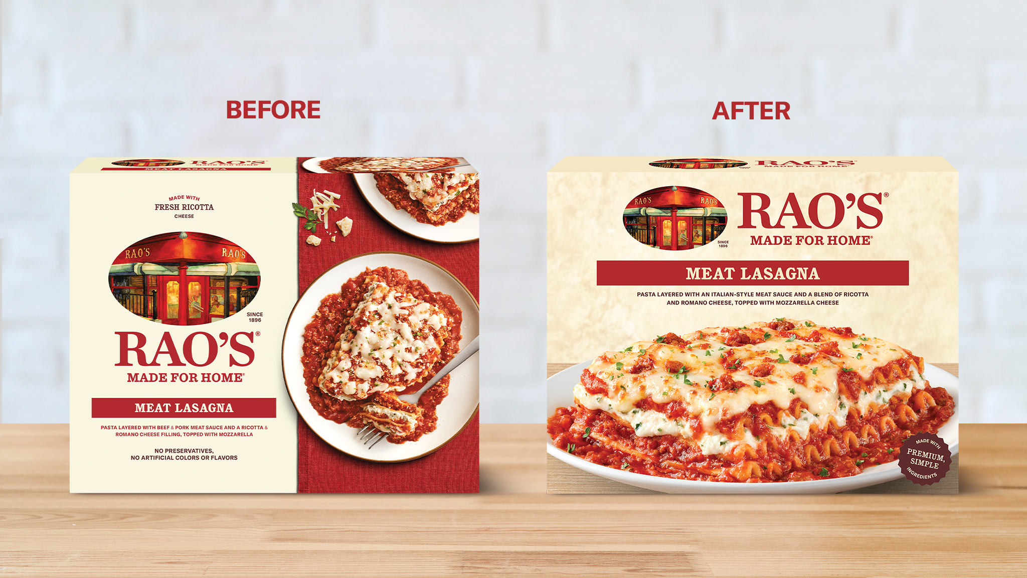
To elevate appetite appeal, we transitioned to a 3/4-angle approach in our food photography, creating a “pack to reality” effect that highlights the rich layers, depth, and indulgent details of each dish. The food takes center stage as the largest element on pack, making it the undeniable hero. This dynamic perspective enhances authenticity, ignites cravings, and reinforces the true to home dining experience.
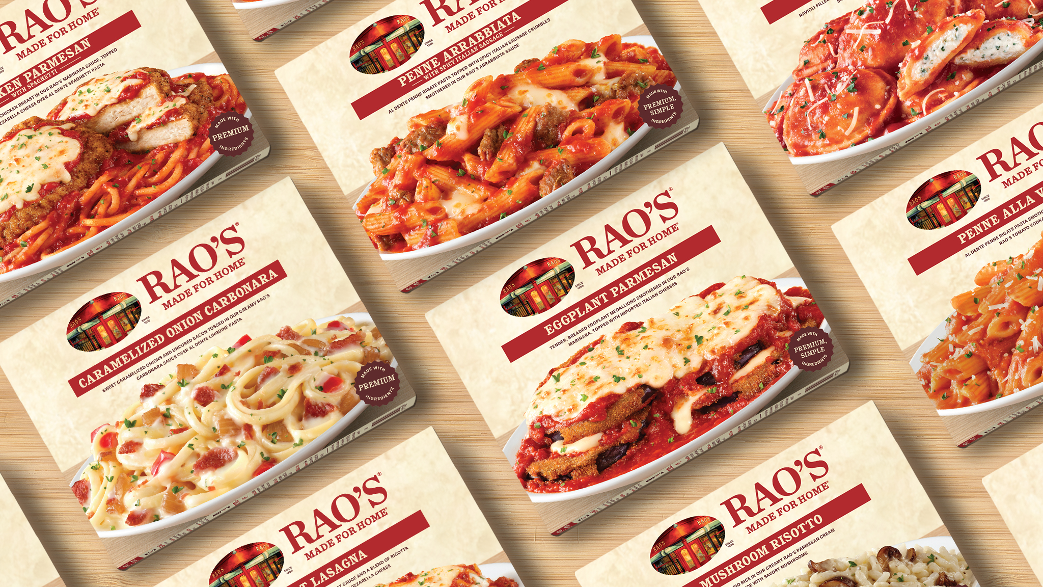
To set the stage for our food photography, we designed a backdrop inspired by the warmth and rustic charm of Tuscany. Rich, kitchen-inspired textures bring authenticity, while Rao’s Made for Home signature cream color reinforces brand recognition and deepens the connection to its Italian-inspired recipes. The background flows seamlessly across the primary display panel, providing a cohesive yet neutral canvas that lets the food and brand elements stand out. The result? A powerful brand-blocking effect that links every box on the shelf, amplifying recognition and commanding attention in the freezer aisle.
We chose to embrace simplicity into the overall design to cut through the visual clutter at shelf and let the product speak for itself with clarity and confidence. By focusing on the essentials—clean lines, minimal claims, and a refined color palette—we aimed to convey premium quality and elegance without overwhelming the consumer. This intentional minimalism makes the packaging both memorable and distinctive, allowing it to stand out and establish a stronger, more trustworthy connection with the audience.
To further emphasize the key elements on the packaging, we strategically chose to incorporate dual finishes. This decision was driven by the desire to create a visual experience that draws attention to the most important features, making them feel more premium and visually distinct. The combination of matte and glossy textures not only highlights these elements but also adds depth and sophistication to the overall design.
Credits